[What is the Perception Project? Start from the beginning.]
Day 2's labels here on Pass the Chiclets are two of my favourites: dramatic and romantic! Over at The Sirenic Codex, they're featuring two other ones I love: illustrated and aquatic.
3. Dramatic


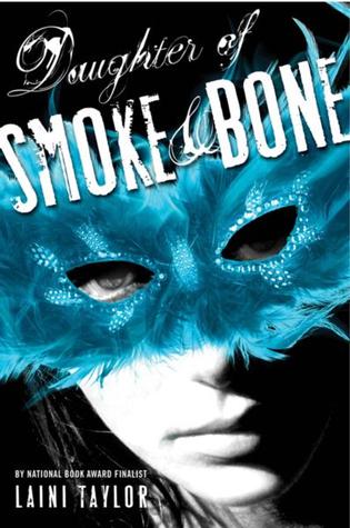
P.E.—Daughter of Smoke and Bone: I love this cover just because it has so much high contrast. The blue pops out, the font is aggressive, and it absolutely screams "Pick me up!" to me. This cover promises a lot of happenings, and makes me curious about why the girl is wearing that feather mask as well.
Mari—The Elite: Everything about this cover is dramatic. It pops out and grabs your attentions. From the outrageously big and beautiful dress to the striking red colour, it’s hard to call this one anything else.
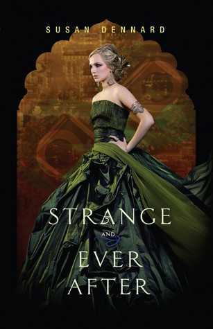
Me—Strange & Ever After: My God, have you seen a more striking colour scheme? The gray-greens give the huge, dramatic dress a near-metallic sheen, while the deep rusty orange and black outline frame the model perfectly. And that expression is so fierce.
4. Photographic


P.E.—Breaking Dawn: The high contrast and clarity in the image and the red pawn placed strategically just so, as well as the reflection make this one of my favourite "photographic" covers. I also love the perspective of the photographer making the chessboard squares into diamonds. It's very deliberately planned, and it looks great.
Mari—If I Lie: I love the grey scale used for this photo. It paints a sad premise and also acts as contrast to the red title. Depth of field is another key component for this one. By blurring out the distance, it's brings our focus to the models.
Me—The FitzOsbornes in Exile: The angle of this photograph is so, so perfect; it looks as if it were a real shot, taken in real life rather than specifically for a cover. The model's posture, turned away from the dancing couple in the background, along with the male model seated behind her out-of-focus all make me feel like this is a moment captured in real life.
So what did we see? In the dramatic label, the most evident aspect is the bright colours. The stark contrast between black, white and a burst of colour helps lend that sense of drama to covers. And we can't forget to mention the girl-in-a-huge-dress trend! It may be a tired trend, but it's definitely a beautiful one. For the photographic label, it's interesting to see my and Mari's covers of real people were mostly gray-scale photos, while P.E.'s inanimate object photo was mostly black and white with one splash of colour. It seems that simplicity is key in photographs.
There's one more installment of The Perception Project to come on Friday! Have you checked out TPP on The Sirenic Codex yet?


