


Welcome to the Perception Project! This little idea sprang from the brain of P.E., blogger over at The Sirenic Codex with co-blogger Mari, during a conversation regarding the different ways we would label certain covers. So to compare the way we perceived labels when it came to covers, I'm happy to be launching The Perception Project with P.E. and Mari!
A week-long project, Pass the Chiclets and The Sirenic Codex will feature two labels each on Monday, Wednesday and Friday along with our own individual picks to match the label and a wee blurb on why it matches the label. That's a total of 12 labels, so please be sure to check both of our blogs to get our thoughts on all twelve!
Today's labels on Pass the Chiclets: sad and simple. Over at The Sirenic Codex, they're featuring classic and romantic. Be sure to check them out!
1. Sad
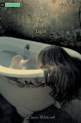

P. E.—A Certain Slant of Light: The bathtub with the girl looking so pitiful, the colours that are completely muted and grayish, even the very small font all contribute to a cover that looks sad to me.
Mari—Fever: Despite the surrounding little nick nacks and a beautiful golden dress, it’s the model's face that draws my attention. She looks so hopelessly depressed. It fits well with the series and makes for a great cover.
Me—Girl in the Arena: There's something heartbreaking about her pose, the weight that she looks like she's bearing, like she's got even worse to look forward to. The spotlight shining on her directly makes her seem vulnerable, along with the fact that we can't see her face.
2. Simple
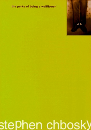


P. E.—The Perks of Being A Wallflower: I wonder how much simpler you can get. The cover is mostly bare except for necessities like the title, author, and one image.
Mari—We'll Always Have Summer: This one is cute, bright and simple. There isn't much going on. Just a girl walking to what seems to be a beach in her pretty white sun dress. Another lazy summer day.
Me—Between Shades of Gray: Despite some elaborate Photoshop to get the snow & the closed eyelid into one cohesive image, I think the overall image is stark in its simplicity. The snow caught in the lashes is so evocative of the actual story, and the plain serif fonts are elegant and uncomplicated.
So what did we see? Well, posture is really important when it comes to sadness, evidently; we all picked models who were posed in moody ways. More variety for the simple label, though; while P.E. went for the minimalist style, Mari chose one with lots of white space, and I chose one that focused on simplicity in terms of colour scheme & stylistic elements.
This variety in opinions is going to be interesting to look at as we roll out the next posts this week. Hope you're as excited to see the covers as I am—thanks for reading, and stay tuned! <3
