


[What is the Perception Project? Start from the beginning.]
The third and final day of the Perception Project here at Pass the Chiclets finds us with the labels typographic and tacky. Over at The Sirenic Codex, they're looking at happy and frightening. Take a look at these covers here, then hop over to TSC.
5. Typographic
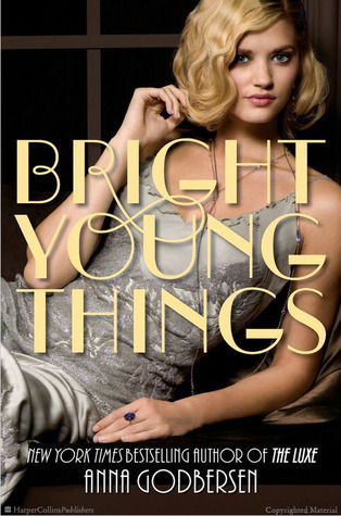
P.E.—Bright Young Things: I had to pick Bright Young Things because the font is the first thing that comes to mind when I think of this series. The font is very distinct. It's called Broadway and it has this arrogant, fancy air that is so very memorable. I think it's the focal point and dominates the cover.
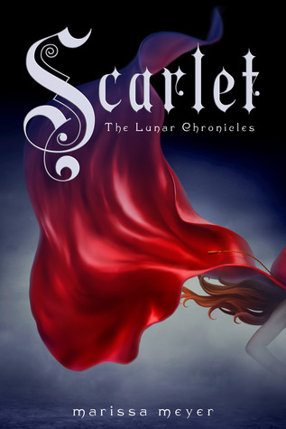
Mari—Scarlet: The typography is one of my favourite things about these covers. The font fits so well with the fairy tale theme. I can almost see the beginning of the stories I used to read. Starting with a fancy capital O, for Once upon a time.
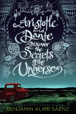
Me—Aristotle and Dante Discover the Secrets of the Universe: Hand-lettering is probably the epitome of beautiful typographic work. The beautiful curlicues stylize this outrageously long title wonderfully and make it the centrepiece of the cover.
6. Tacky


P.E.—Ripple: This cover doesn't work because it look very fake to me. The tree does not look natural, neither does the girl's perfectly smooth head. It looks obviously photoshopped to me. :(
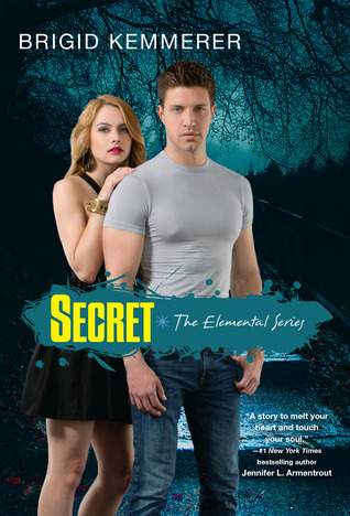
Mari—Secret: There are so many aspects of this one that just doesn't work. The colours don't mesh well, instead they stand out awkwardly and the models are standing so rigidly in the back with their midsection cut off by the blunt yellow title. Also, the shirt the male model is wearing is a little too tight for comfort. Tacky suits this one well.
Me—Blindsided: Ugh, I actually feel horrible for the author with this cover. The gross plastic cartoon sheen to every surface, the garish, clownish colour scheme, the plain fonts and the entire messy set-up that gives no indication of what the book is about... it hurts to look at this cover. Jeez.
So what did we see? The level of typography intricacy obviously differs from cover to cover; PE chose a cover based on a strong statement font, Mari went with the stylized drop-cap-esque letter, and I decided on a full-out elaborate detailed cover. The tacky label varied more, probably because there are many, many ways to have a bad cover. In all three, I think the tacky aspects for each cover were pretty clear.
So that wraps up The Perception Project here at Pass the Chiclets! Make sure you've checked out the 6 different labels at The Sirenic Codex, and I hope you enjoyed that as much as I did. :) <3
