Showing posts with label the perception project. Show all posts

Friday, 8 November 2013

The Perception Project: #3


[What is the Perception Project? Start from the beginning.]

The third and final day of the Perception Project here at Pass the Chiclets finds us with the labels typographic and tacky. Over at The Sirenic Codex, they're looking at happy and frightening. Take a look at these covers here, then hop over to TSC.


5. Typographic
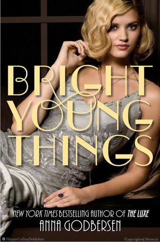

P.E.Bright Young Things: I had to pick Bright Young Things because the font is the first thing that comes to mind when I think of this series. The font is very distinct. It's called Broadway and it has this arrogant, fancy air that is so very memorable. I think it's the focal point and dominates the cover.

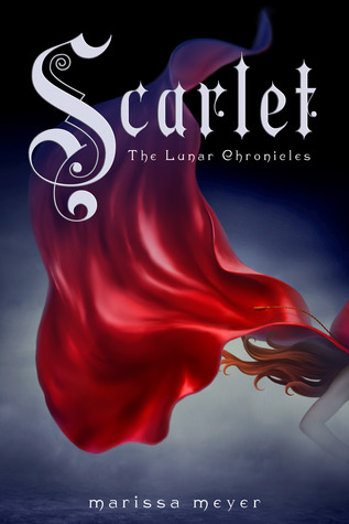
MariScarlet: The typography is one of my favourite things about these covers. The font fits so well with the fairy tale theme. I can almost see the beginning of the stories I used to read. Starting with a fancy capital O, for Once upon a time.

MeAristotle and Dante Discover the Secrets of the Universe: Hand-lettering is probably the epitome of beautiful typographic work. The beautiful curlicues stylize this outrageously long title wonderfully and make it the centrepiece of the cover.


6. Tacky


P.E.Ripple: This cover doesn't work because it look very fake to me. The tree does not look natural, neither does the girl's perfectly smooth head. It looks obviously photoshopped to me. :(

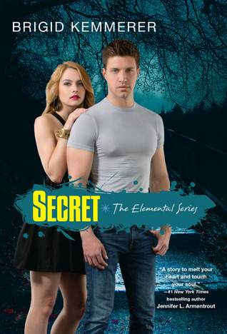
MariSecret: There are so many aspects of this one that just doesn't work. The colours don't mesh well, instead they stand out awkwardly and the models are standing so rigidly in the back with their midsection cut off by the blunt yellow title. Also, the shirt the male model is wearing is a little too tight for comfort. Tacky suits this one well.

MeBlindsided: Ugh, I actually feel horrible for the author with this cover. The gross plastic cartoon sheen to every surface, the garish, clownish colour scheme, the plain fonts and the entire messy set-up that gives no indication of what the book is about... it hurts to look at this cover. Jeez.


So what did we see? The level of typography intricacy obviously differs from cover to cover; PE chose a cover based on a strong statement font, Mari went with the stylized drop-cap-esque letter, and I decided on a full-out elaborate detailed cover. The tacky label varied more, probably because there are many, many ways to have a bad cover. In all three, I think the tacky aspects for each cover were pretty clear.

So that wraps up The Perception Project here at Pass the Chiclets! Make sure you've checked out the 6 different labels at The Sirenic Codex, and I hope you enjoyed that as much as I did. :) <3

Wednesday, 6 November 2013

The Perception Project: #2


[What is the Perception Project? Start from the beginning.]

Day 2's labels here on Pass the Chiclets are two of my favourites: dramatic and romantic! Over at The Sirenic Codex, they're featuring two other ones I love: illustrated and aquatic.


3. Dramatic


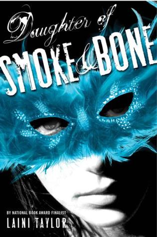
P.E.Daughter of Smoke and Bone: I love this cover just because it has so much high contrast. The blue pops out, the font is aggressive, and it absolutely screams "Pick me up!" to me. This cover promises a lot of happenings, and makes me curious about why the girl is wearing that feather mask as well.

MariThe Elite: Everything about this cover is dramatic. It pops out and grabs your attentions. From the outrageously big and beautiful dress to the striking red colour, it’s hard to call this one anything else.

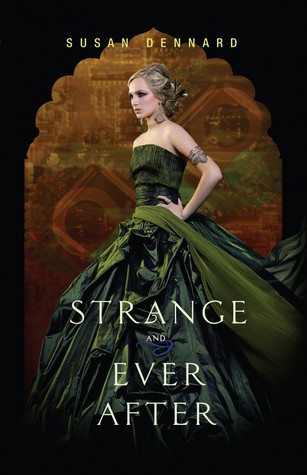
MeStrange & Ever After: My God, have you seen a more striking colour scheme? The gray-greens give the huge, dramatic dress a near-metallic sheen, while the deep rusty orange and black outline frame the model perfectly. And that expression is so fierce.


4. Photographic


P.E.Breaking Dawn: The high contrast and clarity in the image and the red pawn placed strategically just so, as well as the reflection make this one of my favourite "photographic" covers. I also love the perspective of the photographer making the chessboard squares into diamonds. It's very deliberately planned, and it looks great.

MariIf I Lie: I love the grey scale used for this photo. It paints a sad premise and also acts as contrast to the red title. Depth of field is another key component for this one. By blurring out the distance, it's brings our focus to the models.

MeThe FitzOsbornes in Exile: The angle of this photograph is so, so perfect; it looks as if it were a real shot, taken in real life rather than specifically for a cover. The model's posture, turned away from the dancing couple in the background, along with the male model seated behind her out-of-focus all make me feel like this is a moment captured in real life.


So what did we see? In the dramatic label, the most evident aspect is the bright colours. The stark contrast between black, white and a burst of colour helps lend that sense of drama to covers. And we can't forget to mention the girl-in-a-huge-dress trend! It may be a tired trend, but it's definitely a beautiful one. For the photographic label, it's interesting to see my and Mari's covers of real people were mostly gray-scale photos, while P.E.'s inanimate object photo was mostly black and white with one splash of colour. It seems that simplicity is key in photographs.

There's one more installment of The Perception Project to come on Friday! Have you checked out TPP on The Sirenic Codex yet?

Monday, 4 November 2013

The Perception Project: #1


Welcome to the Perception Project! This little idea sprang from the brain of P.E., blogger over at The Sirenic Codex with co-blogger Mari, during a conversation regarding the different ways we would label certain covers. So to compare the way we perceived labels when it came to covers, I'm happy to be launching The Perception Project with P.E. and Mari!

A week-long project, Pass the Chiclets and The Sirenic Codex will feature two labels each on Monday, Wednesday and Friday along with our own individual picks to match the label and a wee blurb on why it matches the label. That's a total of 12 labels, so please be sure to check both of our blogs to get our thoughts on all twelve!

Today's labels on Pass the Chiclets: sad and simple. Over at The Sirenic Codex, they're featuring classic and romantic. Be sure to check them out!


1. Sad


P. E.A Certain Slant of Light: The bathtub with the girl looking so pitiful, the colours that are completely muted and grayish, even the very small font all contribute to a cover that looks sad to me.

MariFever: Despite the surrounding little nick nacks and a beautiful golden dress, it’s the model's face that draws my attention. She looks so hopelessly depressed. It fits well with the series and makes for a great cover.

MeGirl in the Arena: There's something heartbreaking about her pose, the weight that she looks like she's bearing, like she's got even worse to look forward to. The spotlight shining on her directly makes her seem vulnerable, along with the fact that we can't see her face.


2. Simple


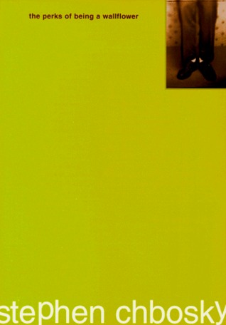
P. E.The Perks of Being A Wallflower: I wonder how much simpler you can get. The cover is mostly bare except for necessities like the title, author, and one image.

MariWe'll Always Have Summer: This one is cute, bright and simple. There isn't much going on. Just a girl walking to what seems to be a beach in her pretty white sun dress. Another lazy summer day.

MeBetween Shades of Gray: Despite some elaborate Photoshop to get the snow & the closed eyelid into one cohesive image, I think the overall image is stark in its simplicity. The snow caught in the lashes is so evocative of the actual story, and the plain serif fonts are elegant and uncomplicated.


So what did we see? Well, posture is really important when it comes to sadness, evidently; we all picked models who were posed in moody ways. More variety for the simple label, though; while P.E. went for the minimalist style, Mari chose one with lots of white space, and I chose one that focused on simplicity in terms of colour scheme & stylistic elements.

This variety in opinions is going to be interesting to look at as we roll out the next posts this week. Hope you're as excited to see the covers as I am—thanks for reading, and stay tuned! <3