


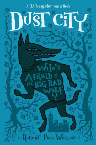
Both those covers make you go "WOW." The first one for its menacing and mysterious look -- that fog wrapping around the title is beautiful, and those eyes must be the best face I've seen on a cover. (It's shiny in real life, too!) The second one for its style -- the quirkiness of the illustration, plus the awesome tagline placing. And did you notice the trees (so important) and the little city there?


Excuse me while I sob.
WHAT happened to the ARC cover, that first one there? We go from "Interesting, a girl in a simple dress (for once!) with a lovely background" to "Okaaay, bright turquoise...?" to "Whoopdeedoo. Another close-up of a girl face". Yaaaaaay.


The first one, the hardcover, is most definitely evocative of the novel's tone and lush atmosphere. The second one may turn off less foreigner-phobic non-Asians. And the third is neither -- it's the Indonesian edition. :D Isn't it lovely?
